Screen Layout and Basic Operations
This tool supports both landscape and portrait orientations.
Since the screen layout and operation methods vary depending on the screen orientation, please refer to the screen configurations and operation methods described later.
Screen UI Layout and Operation Method
Screen layout in landscape orientation: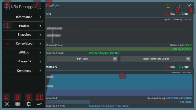
Screen layout in portrait orientation: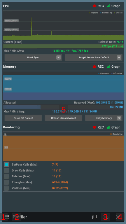
1. Menu
You can see the list of available features.
In landscape orientation, you can display the feature in the main content by selecting the feature you want to use from the left menu.
In portrait orientation, press the [≡] button to display the menu.
If you close the tool and display it again while the app is running, it will display the feature you displayed last time.
Each item in the menu displays a badge under specific conditions.
| Feature | Appears | Disappears |
|---|---|---|
| ConsoleLog | An error log is recorded in ConsoleLog. | ConsoleLog is displayed. |
| APILog | An error log is recorded in APILog. | APILog is displayed. |
2. Feature Name
Displays the name of the function you have selected. In portrait orientation, you can open the menu by pressing this.
3. Enabling Overlay/Floating Window
For some features, enabling the overlay/floating window allows you to use the features even if the tool is not displayed.
Pressing the enable switch button toggles the enable flag for the relevant feature's overlay/floating window.
Orange indicates enabled, white indicates disabled.
The enable flag will be kept even if you restart the app.
Overlay
The overlay has an [ ] button for enabling/disabling and a [
 ] button to transition to the settings.
The configurable items vary depending on the feature.

Please refer to About the Overlays for detail of overlays.
Floating Window
The floating window only has a [ ] button for enabling/disabling.

Please refer to About the Floating Windows for detail of floating windows.
4. Close Button
The tool is closed by pressing the [×] button.
5. Main Content
Displays the content of the function you have selected.
6. Tool Details Button
By pressing the [NOA Debugger] button at the top of the menu, you can display the details of the tool.
In portrait orientation, you can only press it when the menu is open.
7. Version Information
Displays the version of the tool.
8. Controller Display Button
By pressing the [ ] button, a controller appears that allows you to perform various operations.
For more details on the controller, please refer to Launching Tool.
9. Settings Button
Displays the NOA Debugger settings screen.
For more information about the settings screen, please refer to Settings Screen described later.
10. Menu Switch Button
Switches between the custom menu and the NOA Debugger provided menu.
For more details on the custom menu, please refer to Adding Custom Menus.
Tool Details
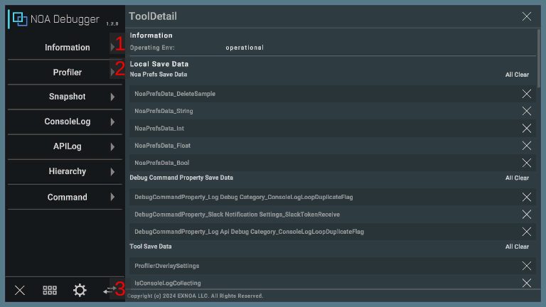
1. Operating Env
Shows whether it's the tool's system requirements.
If it meets the system requirements, it will display "operational". If it does not, it will display the recommended environment.
2. Local Save Data
It displays the keys of the data stored in the NOA Debugger's own storage area.
By long pressing the [×] button, you can discard the stored data individually.
You can discard all the stored data by pressing the [All Clear] button.
| Group Name | Contents |
|---|---|
| Noa Prefs Save Data | The keys of the data saved via NoaPrefs. |
| Debug Command Property Save Data | The keys of the data saved with theSaveOnUpdateAttribute attribute. |
| Tool Save Data | The keys of the stored data that NOA Debugger is using. |
3. Copyright
Displays the copyright of the tool.
Settings Screen
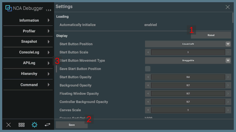
This screen allows you to change NOA Debugger settings at runtime.
The default values reflect the settings configured in the NOA Debugger Editor.
For information on each setting item, please refer to Tool Settings.
1. Reset Button
Pressing the [Reset] button discards the settings changed at runtime for the target item and applies the default values.
2. Save Button
Pressing the [Save] button saves and applies the changed values.
The [Save] button is displayed only when there are unsaved settings.
3. Value Override
Indicates settings changed at runtime.
Settings changed at runtime are saved as cache data, so clearing the cache will restore the default settings.
Pressing the [Reset] button resets the settings changed at runtime.
Runtime Change Notes
| Setting Item | Notes |
|---|---|
| Log | If you change the number of logs to keep at runtime, all kept logs will be deleted. |
Display Font
This tool cannot display non-ASCII characters by default.
If you want to display non-ASCII characters, please set a font asset that includes characters to display by referring to Tool Settings.
Note: Characters that cannot be displayed with the set font will be replaced with other characters by the fallback process of TextMeshPro.